The Sydney pavilion of the Shanghai Biennale 2012 was one of the better places to visit. At first sight, it struck the visitor by the strong ‘op-art’ visual identity created by translucent foils pasted on the windows. The same op-art element was repeated on and in the booklet accompanying the exhibition. The booklet credited a well know advertising agency with the design. I found it fitting to the high-street location as well as a good way to make up for some of the shortcomings of the exhibition space (an old building scheduled for reconstruction). The translucent foils created a soft light, which would be suitable for paintings or sculptures, but the space was mainly dedicated to media art and installations. This was a bit of a problem for some of the projections, but that was just a small glitch on the overall exhibition design.
One of the artworks by an art group called Bababa International was closely related to the exhibition architecture itself – it consisted of a number of corridors ‘hidden’ behind artificial moving walls. If one pushed against one of the gallery walls, a section of the wall slid back and the corridor was revealed. This was a very playful artwork, which at the same time reflected on the notion of exhibition architecture and its function of displaying-through-hiding.
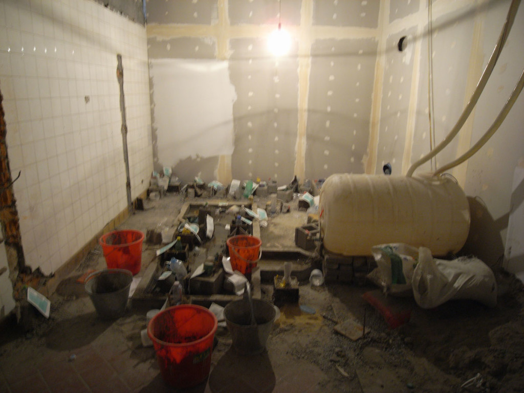
 Bababa international also supplied an artwork in the form of a ‘construction site’ with molds, cement and plastic bottles, where visitors could work with the materials to create their own ‘construction sculptures’.
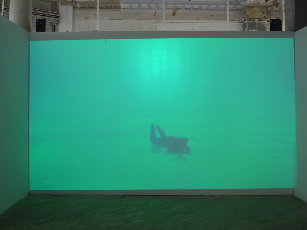
 The main space of the ‘shop front’ space featured in addition to Bababa’s moving walls two projection spaces. Shaun Gladwell’s Pacific Undertow Sequence was a looped video of a surfer. After a while of watching, it was revealed that the video is screened upside down, and the surfer is surfing upside down as well – beneath the water. The topic of relativity, illusion and different viewpoints addressed in the video went on throughout the exhibition – as already mentioned in Bababa’s moving walls.
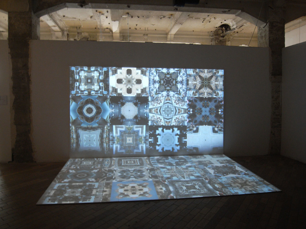
 Khaled Sabsabi showed two videos which looked like a kaleidoscope comprised of small moving image snippets. Individual images were difficult to read, but they gave an impression of travel memories and moving around: Many separate moments in space and time, coming together in one mosaique.
 Raquel Ormella presented a multi-channel video installation of a mundane scene of a landscape with pigeons and a street sweeper: ‘Here we are’. As in the inverted-surfer video, this work addressed the notions of real/unreal. The image was fragmented into multiple projections that have been reassembled to the final scene. The result with its computer-generated birds and rubbish reminded me of the early 20th century dioramas, which were also simulations of spatial situations. But by choosing a completely ‘normal’ scene, it was as if the artist was questioning the meaning of the simulation itself.
In the back side of the ‘shop’, Andrew Brook’s photo-prints on canvas – the only canvas-based work in the show – were on display. Silk-screened reproduction of photographs in silver hues reminded of Andy Warhol’s signature works. But the content shifted from celebrities to minorities: These were images of aboriginals or specific ethnic groups, as known from ethnographic publications. The gaze of the audience directed towards a celebrity has been transformed into the gaze of a colonizer onto the colonized. The source photos spoke of past ages, but the artwork that made use of them transported them into a new context, juxtaposing a pop-art aesthetic with the surviving neo-colonial gaze.
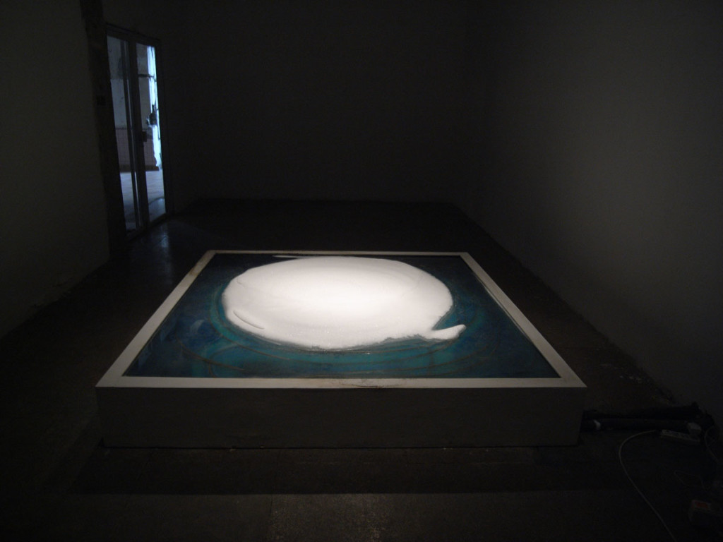
 In the back of the exhibition space, there was another separate room dedicated to the work of Shen Shaomin. In the centre of the room a flat horizontal piece of cooling equipment was producing a layer with a slowly growing mountain of ice. This work was a bit ambiguous. And I wondered whether this was supposed to be an ice sculpture that melted, or a slowly growing ‘organic’ ice sculpture. It was not clear whether the artwork was in a process of decay or growth. Even if I am not sure whether this ambiguity was intended or the result of a technical flaw, it had a certain charm.
 Overall I appreciated that the curator behind this (Aaron Seeto) opted for artists and artworks that were more about asking questions than about giving statements. The feelings produced were sometimes ambiguous but they created a coherent impression as a whole. There were subtle references to ‘Australian’ topics (the surfer, the aboriginal), but this was well embedded in the overall theme of the show and not dominant in any way. It was balanced out by universal topics like the Bababa construction site or Ormella’s ‘Here we are’ which could be seen as a reference to the image of an “ideal city” that each city is trying to produce. The topics were clear, the exhibition architecture made sense, and the visual design created a nice overarching theme, especially linking into Khaled Sabsabi’s kaleidoscopic works.
(Officially, the Shanghai Biennale runs until March 31st, 2013, however unofficially I can tell you that I have passed by this pavilion and it seems to be closed already.)