PLATEAU, Samsung Museum of Art, Seoul, http://www.plateau.or.kr
November 2012 – February 2013
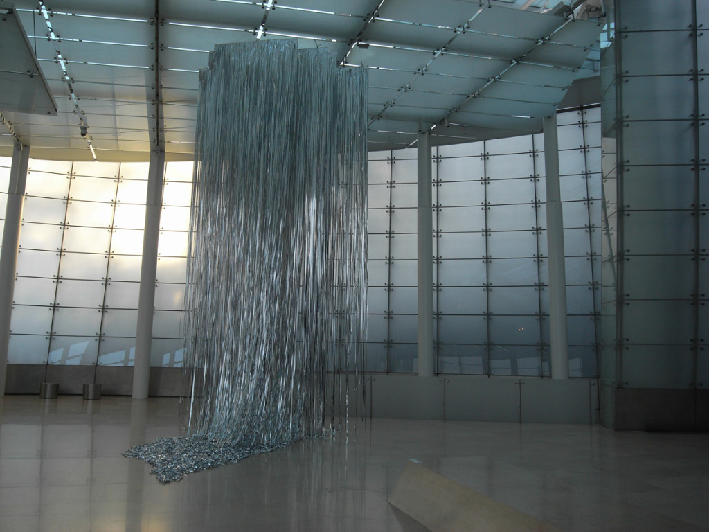
The show brought together a number of Korean artists by selecting artworks that have a relation to the central topic of “landscape”. In the entrance space of the gallery the visitor was greeted by a sound installation of bird and animal sounds accompanied by a glittery ‘silver waterfall’ made from plastic strings hanging down from the ceiling (artist: Sora Kim). Right next to it was the permanently installed ‘Door to Hell’ by Auguste Rodin. This all made for quite a surreal experience, but thankfully there was a bench to sit down and contemplate on this.
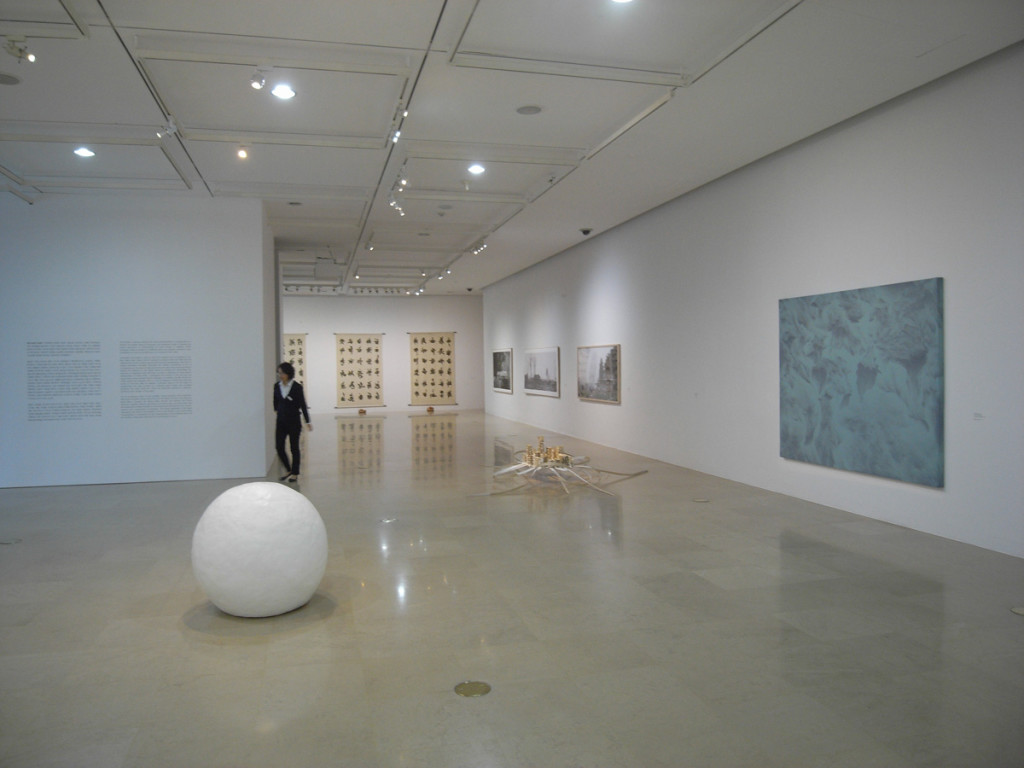
 Venturing into the main gallery space, the visitor encountered a mixture of media and styles. There were two sculptures of large (snowman-size) ‘snowballs’ by Chung Seoyoung. Without reading that they are snowballs, one would probably just think of them as plaster balls.
 Another sculptural work on show was made by Dong-Yeon Kim. Here the material looks rather lightweight – thin wooden or paper strips, a similar material as used in architectural models. Her models of highways seemed to had come alive and were woven intro unreal shapes, or – in the instance of another artwork – seemed to have turned into ‘octopus legs’ on which the city buildings can get up and walk away.
 Lee Bul took a similar approach, working with architectural models. In his/her case appropriated models of buildings are loosely merged into a new postmodern sculptural patchwork.
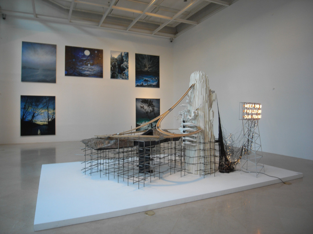 Lee Bul’s artwork shared the exhibition space with paintings of Kong Sung-Hun and Lee Seehyun. Kong’s works were dramatic renderings of landscapes where the darkness takes over the light. Lee’s painting was kept in one hue only – a landscape comprised of a collage of sea and islands in red color on white background. I read it a reference to traditional literati painting styles (the execution of the painting) as well as the ‘red’ danger looming in the north (the color)…
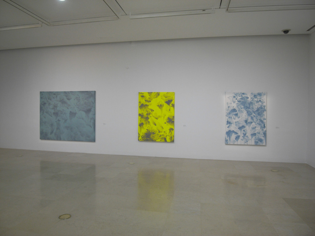
Talking about paintings, I should mention Moon Beom, whose work is abstract but the shapes produced have a very ‘realistic’ feel to them, as if they are depicting something. Was it a depiction of the movement of the brush? Or of the movement of thoughts?
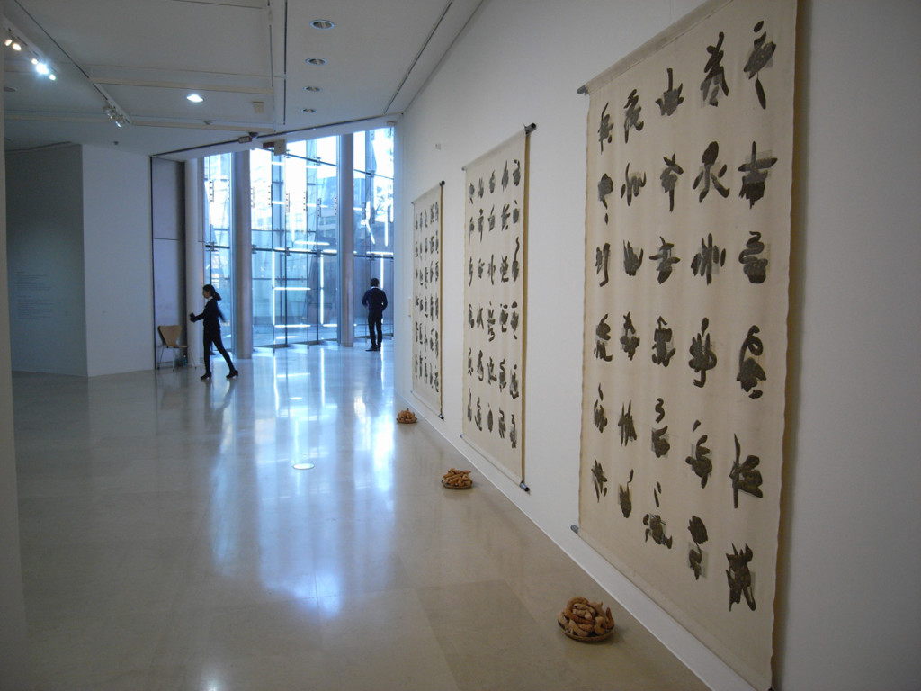
 Kim Hong Joo exhibited a painting which looked like calligraphy form a distance, but a closer look reveals that what we thought of as brush strokes are actually just minutely painted scattered lumps of mud. The canvases were accompanied by a sculptural representation of the ‘lumps of mud’ whose form was similar to that of human/animal excrements.
 The work of Nayoungim & Gregory Maass was placed outside of the exhibition space and engaged directly with the architecture of the museum: In the small courtyard, a neon sign declared: “Perfect”: A simple act turning the courtyard into a ‘perfect’ place – just by saying it.
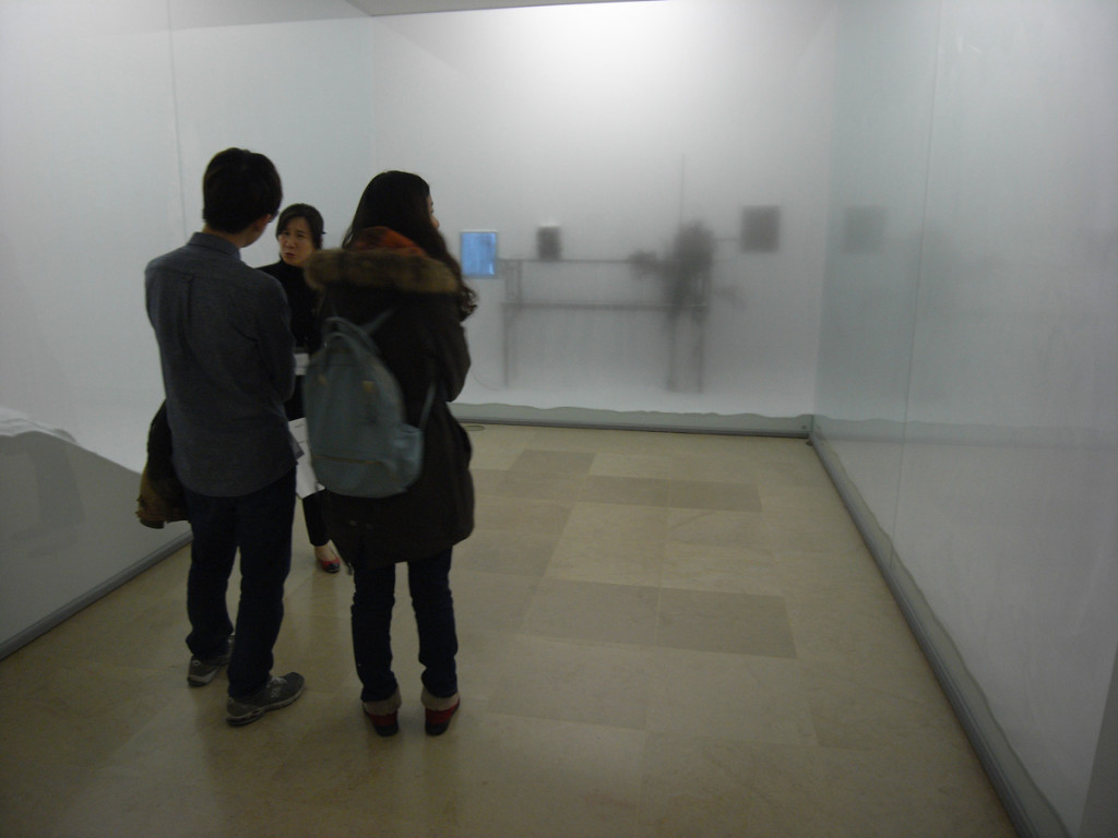
Kibong Rhee’s work was an installation housed in a separate room. It consisted of a U-shaped display area that was filled with fog and separated from the viewer. Through the fog, the viewer could see stacks of books and TV monitors showing the burning of documents. The artificial fog gave a theatrical expression to the piece, yet rather obscured the meaning of the piece. Everything turns into fog (dust)?
 Kang Hong-Goo paints over photographs of landscapes to create a real-imaginary connection. I don’t have any special recollection of his/her works in this show. Yongseok Oh was showing a video piece which consisted of a compilation of landscape shots that are often shown in the end of movies when the credits are rolling. Oh combined these shots into an endless loop aligned according to the horizon – the impression of a never-ending pan though the movie landscape. For me the idea may be funny, but the execution of the idea did not add much more to it, rather, it took away something from it. Sometimes the idea can be the whole work – there is no need to execute it. In this sense I like Kim Beom’s work more, and actually I think it is my favorite from the whole show. His/her work on show was text based – a simple canvas stating ‘look at this sky – stare at this trees – look at this river’ leaving all the imagination to the viewer. Another of his contributions to the exhibition has been a wall text on ‘How to become a rock’ and on ‘How to become grass’: Very simple, but imaginative work.
 I enjoyed the chance of getting to know some Korean artist’s work. The show gave a bit of a sterile impression on the whole. While there were conceptual connections between the works, in the exhibition space they somehow seemed to be disconnected. Maybe the reason was the array of media included in the show. Maybe my impression has to do more with the space than the artworks, and it was the rather scarce distribution of the artworks in the exhibition space that influenced me. This is a strange comment from me, because usually I like minimalist installations. When talking about the artworks, I felt that most of them ‘gave away’ their meaning at first sight, and there was not much more layers to dig into when watching them for a longer time. If one watched for a longer time, the thinking quickly jumped over to the actual object of representation in the artwork. The artworks seemed like hyperlinks leading to different realities, more like portals than vessels.
