Seoul, April 19 – April 27, 2024, http://ujeongguk.com & https://www.forkingroom.kr
It has been 9 years since my last visit. Ujeongguk is still there and looks about the same. The current exhibition seems to be organized by an entity called “Forking Room” and is in fact a mini-festival consisting of an art show, artist talks, lectures and the presentation of a new series of written essays/ publications that are dealing with the paradigm shift caused by digital media technology, lately also known under the “artificial intelligence” buzzword.
On the ground floor the visitor first encountered a large projection, where four videos were running in a loop. I saw Susan Schuppli’s “Not Planet Earth” and Russel Hlongwane’s (with Francois Knoetze & Amy Louise Wilson) “Dzata: The Institute of Technological Consciousness”.
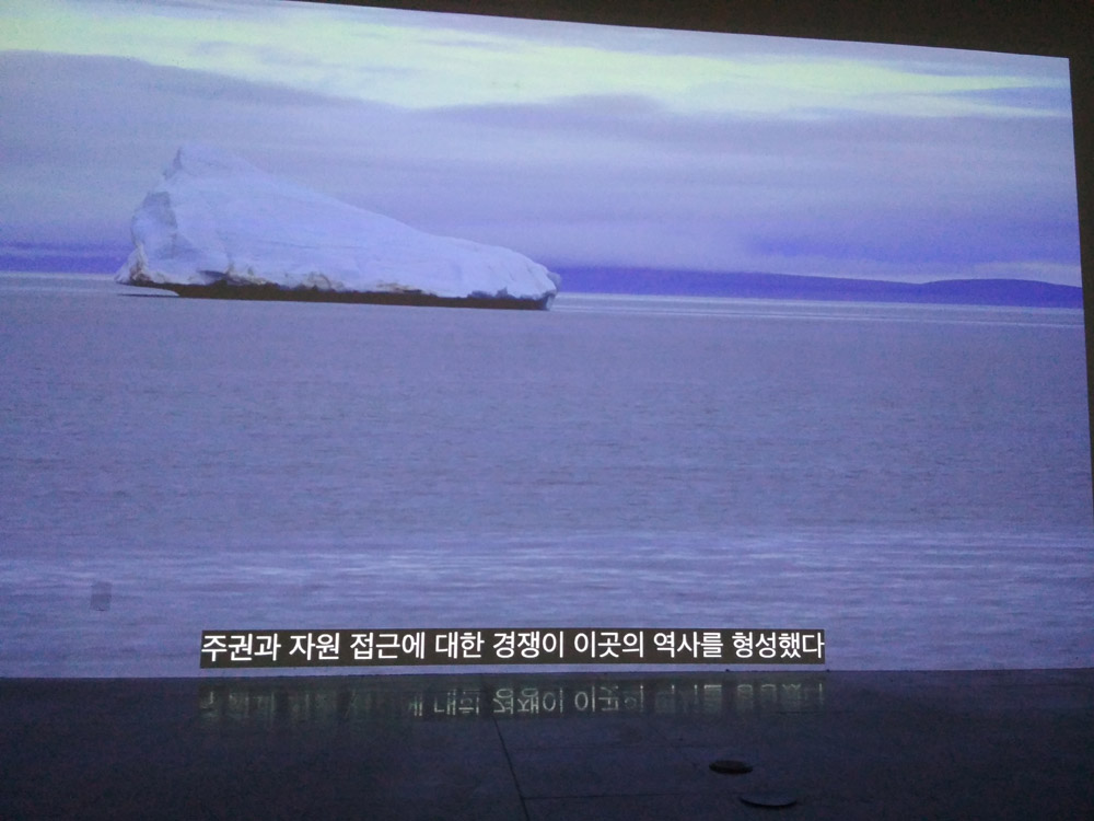
The first was a result of Schuppli’s boat trip to some polar region. Shaky and glitchy video shots of melting icebergs, accompanied by a voice-over that used the technical defects of the video as metaphors of the issues related to human interference with the earth environment and the resulting impact. It was a nice way how to turn one’s lack of technical skill into something that is still showable and viewable. I had to think of Schuppli at transmediale 2023. How she struggled to control the PowerPoint presentation. A kind grandma in a bright sweater telling stories.

Hlongwane/Knoetze/Wilson’s work was a kind of afro-futurist-trash-science-fiction. Not boring, mashing up many kind of film production technologies from funny costume performances to 3D animation and drone footage. However also not very clear in what it actually was about.

I skipped the other two works on the reel. “Onset” by Anna Engelhardt & Mark Cinkevich seemed to be about the Annexation of Crimea and the Russia-Ukraine conflict, “Dry Skies, the Eyes, and the Altar” by SueJin Hong홍수진, seemed to be also about some war-related topic, or at least the 1 minute I saw was.
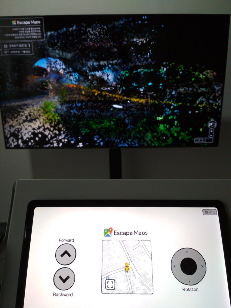
“Escape Maps” looked like an alternative google map and reminded me of the alternative art browsers that some artists created in the 90’s and early 00’s. “See the Google street view differently.” I did not understand the transformational process behind it. It was a pity that even though it was an “alternative”, it made use of exactly the same user interface with an ugly skin on top. Or was it because it used the original google engine only with a modified skin on top? The main screen contained colorful elements rendered in 3D on a black background. The secondary screen with the control interface was bright white with hand-drawn remake of google map control buttons. The two “worlds” did not match together. The authors: Ubac Studio우박 스튜디오 (Hyeunjoo Woo우현주, Jiyoon Park박지윤)

Bit tired of writing, here some images of some other artworks:
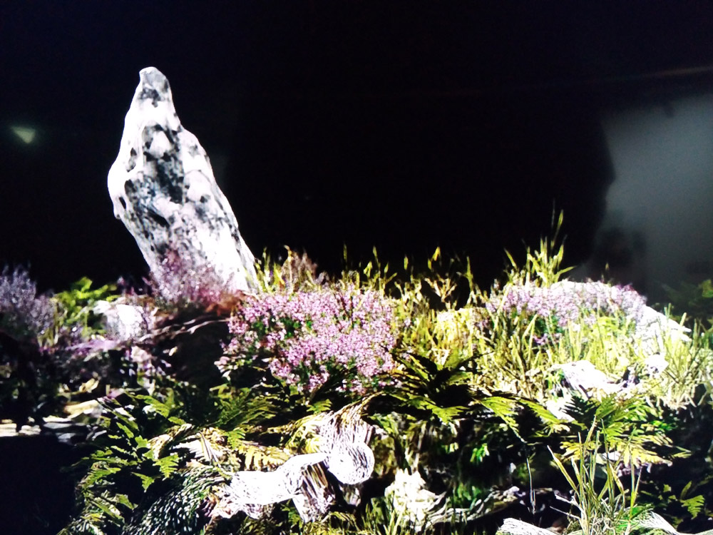
Paul Dolan – Lithic Orbit (photorealistic slowly animated 3D renderings of rocks and grasses).

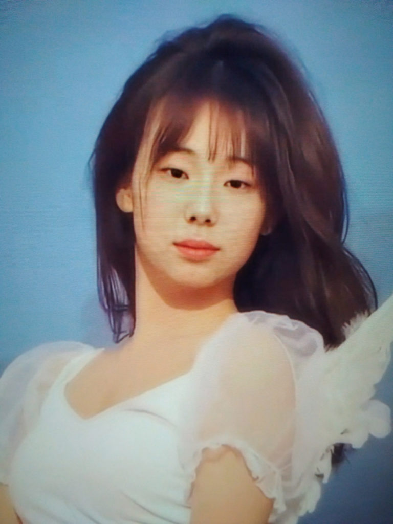
Heejo Kim 김희조 – Will you Still Take Me to the Beach Even When I Grow Old and Wrinkly? (an installation with sand, empty glass bottles, plastic kitsch and two vertical screens showing colorful kitsch landscape imagery alternating with AI-improved “portraits” of real/unreal beautiful young faces.)

Hyeseon Jeong정혜선 & Seongmin Yuk육성민 – The Backpack of Wings: Modern Mythology (a very long video, something kind of design fiction about migratory birds using a navigation system mashed up with some Chinese dragon mythologies about the creation of the world)



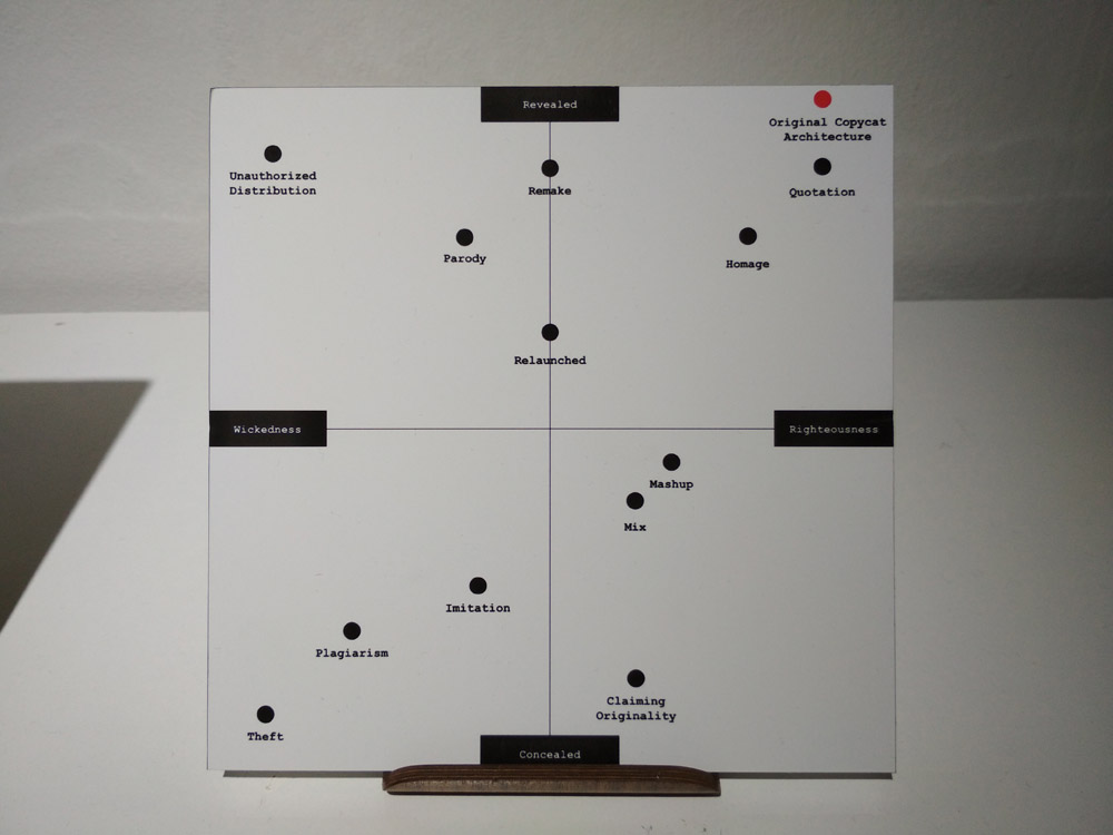
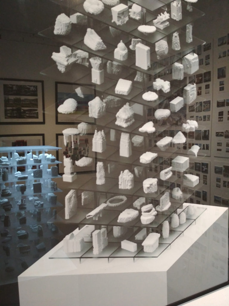
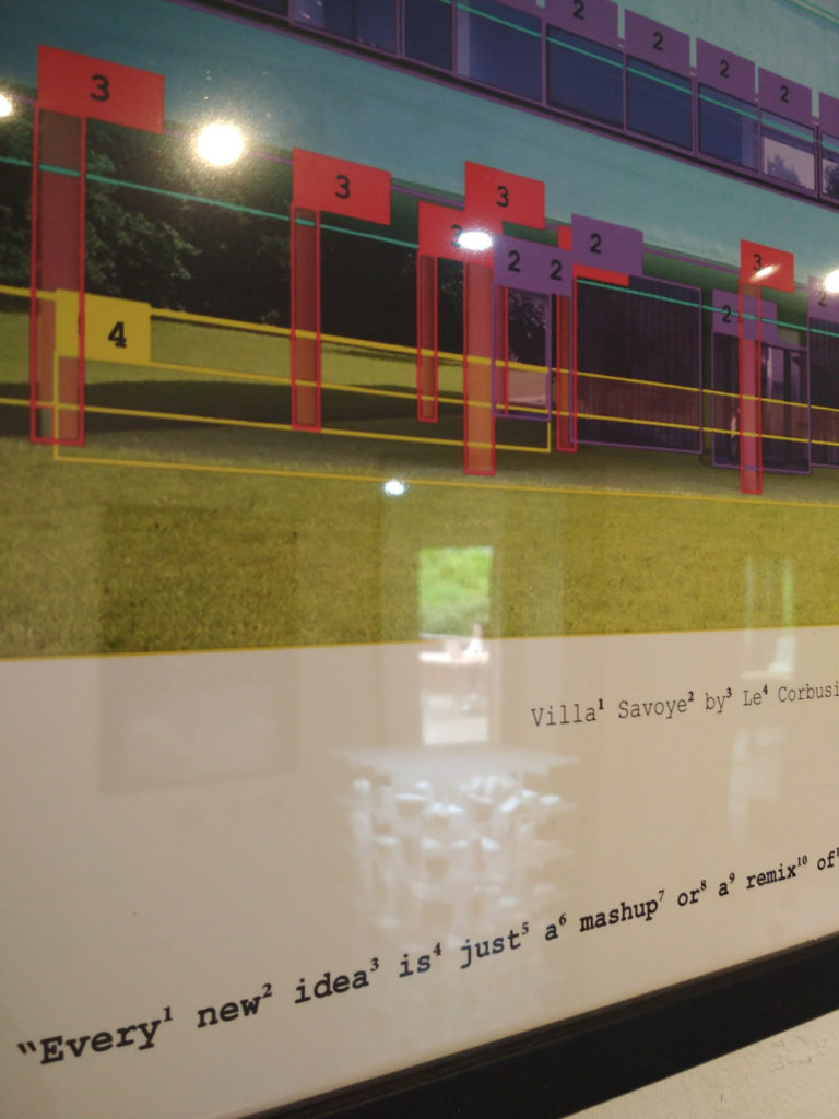
“Original Copycat Architecture” by prison breaker프리즌브레이커 (Jiyong Chun전지용, Junwoo Choi최준우, Seongjae Ahn안성재) – a very complex research-based work pondering about the impact of digitalization on the role of an architect and what it means to be “original”. The introduction of artificial intelligence of course acts as another accelerator here. Because, as we know, the “creativity” of AI is largely faked and based on either creating mash-ups or existing works or relying on real human input in the background (e.g. the aptly named amazon mechanical turk). How come all the buildings around the world look more and more “similar” no matter how “creative” architectural studios are hired? Very interesting questions, and of course could be applied also to other areas of human computer aided production. The work was well researched, made use of different mathematical analytical methods and also managed to show the output in a visually enticing form. This was in my view the most deep and thorough work of the whole show. Of course it’s also because it featured plenty of concise well written explanatory texts in English. It would deserve more space and I hope to see it again in a much larger scale again.

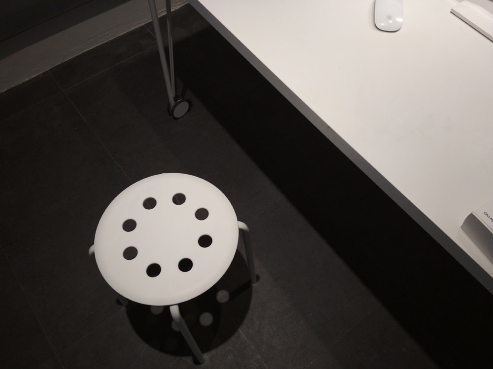
Cho Hyunseo’s조현서 “Pygmalion Project” was also addressing the questions of AI generated imagery and originality. However, I was not able to quickly understand what the whole thing was about. And as the “output” seemed to be in the form of silkscreens and a polystyrene sculpture, I suspect the whole AI narrative was simply used as a smokescreen trying to spray some magic AI-powder onto his/her rather classical (but in no way bad) painterly and sculptural practice.


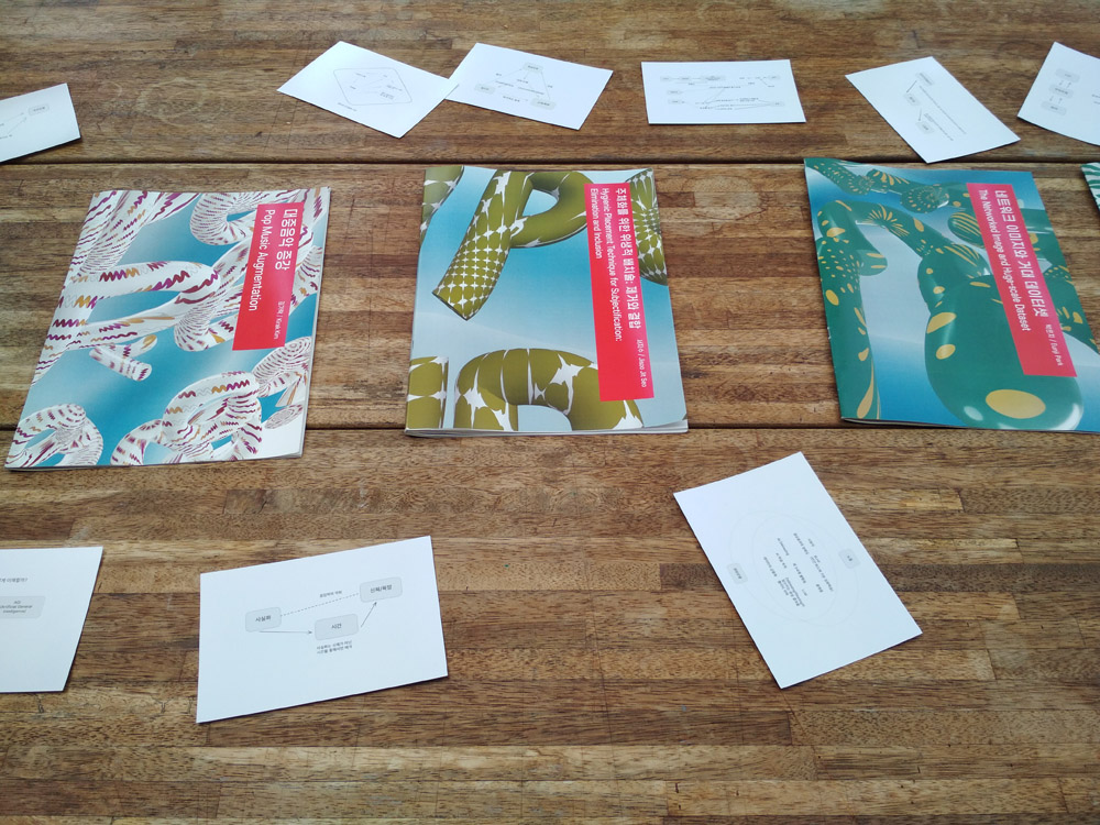
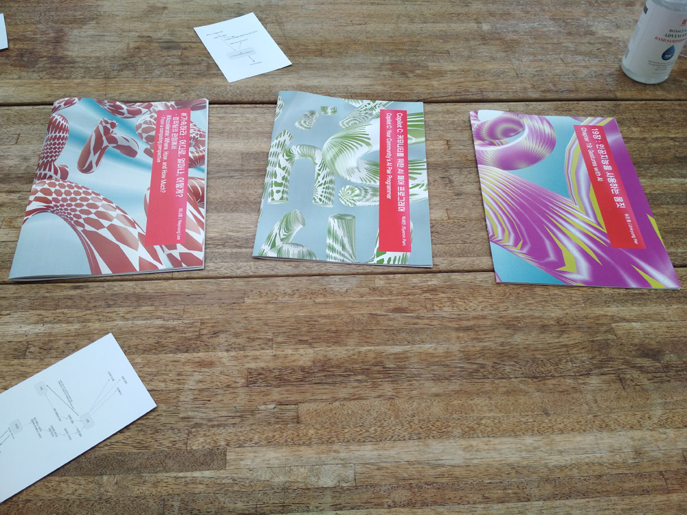
The new research essays premiered as part of the show were lying on a big table. Unfortunately all in Korean. The contents seemed to deal with the politics of images, digital media, etc.,

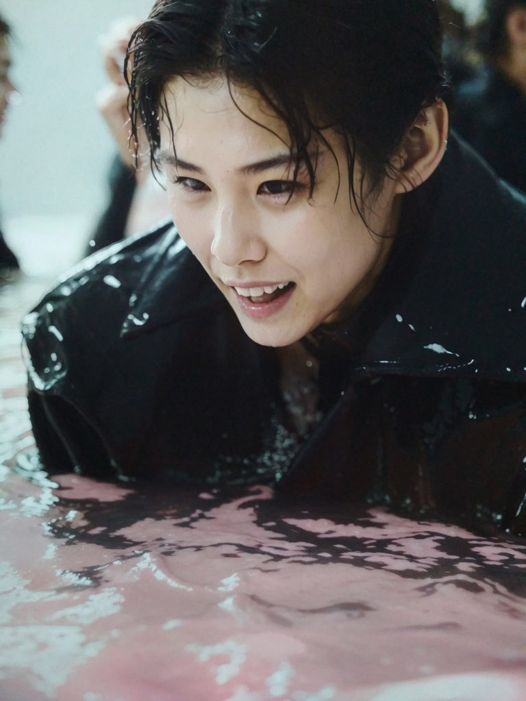
Min young Kim김민영 – Pink Flood (photo prints)
IKEA MARIUS stool in white, ₩7,000
IKEA GLADOM tray table in black, ₩14,900
