Prague, September 22 – 28, 2017, https://lustrfestival.cz
The fourth edition of a festival dedicated to contemporary illustration. In fact, the focus was on the youngest generation of illustrators emerging in Czech Republic with a number of foreign guests invited. This event was on the design side, which had its advantages. It was incredibly user friendly. Everything was super beautifully installed, held together by a strong visual identity and smooth visitor experience. The festival was taking place in a large uninhabited house scheduled for renovation, i.e. it was not a simple white cube. It was spread around numerous floors and spaces. Nevertheless, the signage guided me seamlessly through the different spaces. The perfectionism and obsession with details that numerous designers have was very useful here.
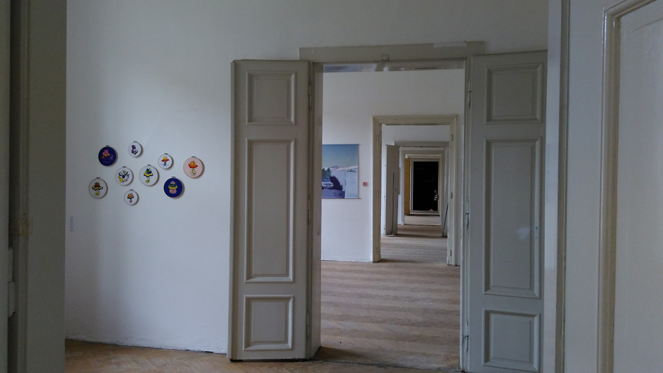
Individual artists were in charge of their own installations. There was a healthy variety of approaches, from traditional framing under glass to more adventurous approaches making use of a broad range of hangings and presentation formats. Content-wise, one had to wade through a lot of “typical” illustration work, with cartoonish characters featuring oversized or deformed heads, bodies or other body parts, all in joyful colors. But this was just one type, and there were also more “artsy” or “cool” approaches, more in line with my tastes.
I took a few snaps of artworks that somehow moved me enough to press the shutter. The order is random alphabetic.
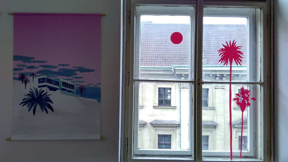
Alica Kucharovic: Advanced and smooth Adobe Illustrator work and a nice clean canvas print, I appreciated the effort to make the window part of the show, it made a big difference.
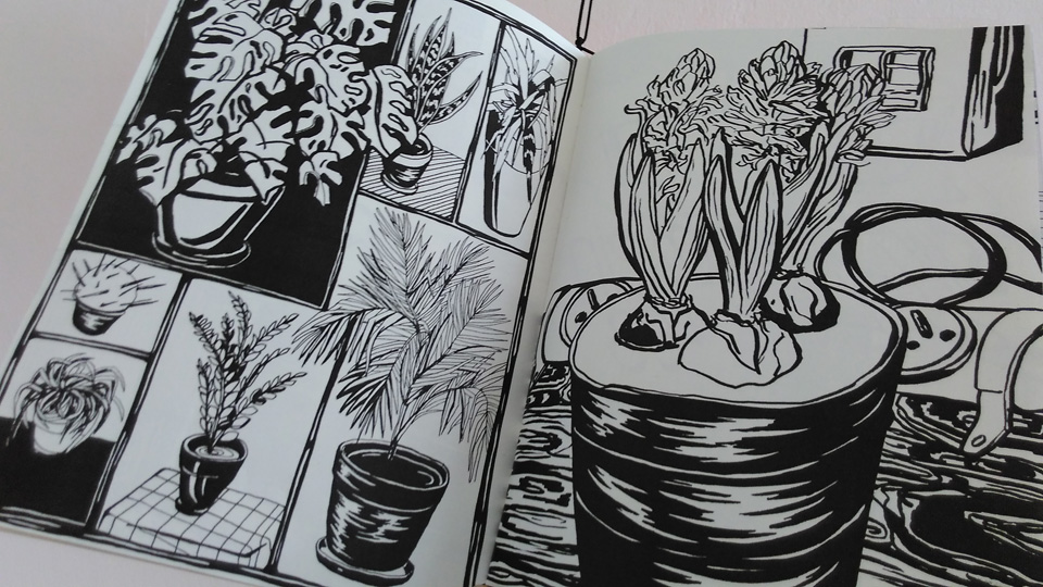
Bara Ruzickova: An illustration diary from what was probably an Erasmus study-abroad semester in the Netherlands. The motives were everyday and banal, the drawing traditional, but I appreciated the immediacy and freshness of the work, a promise of more to come.
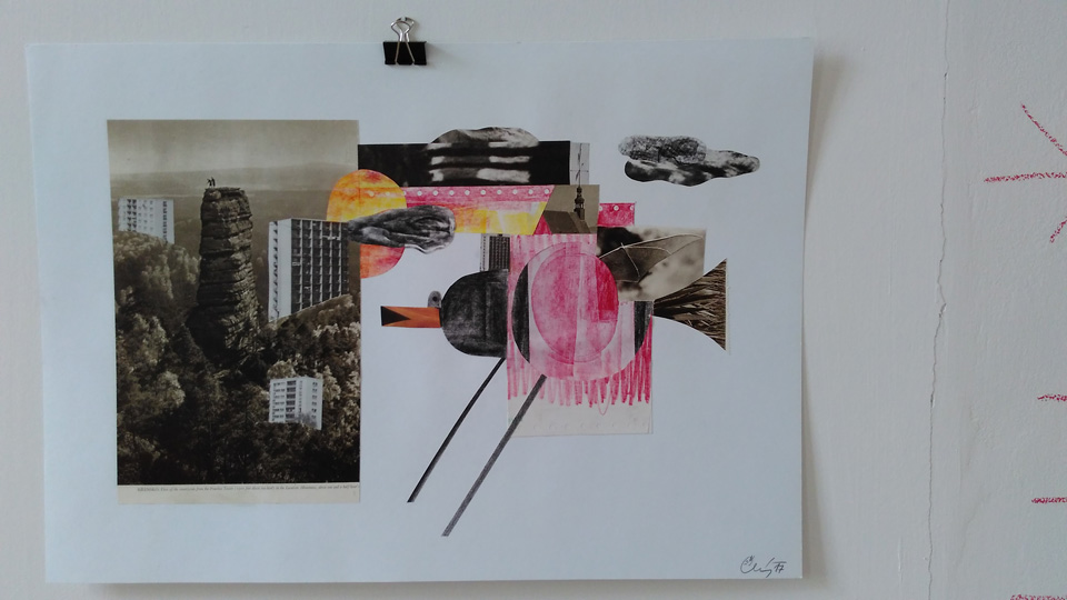
David Cerny: There were not many collages, and so these stood out. Collage is a traditional medium, and this work looked very traditional, but somehow, I enjoyed the combination of old and new, accompanied slightly ridiculous titles written with a wax crayon on the wall.
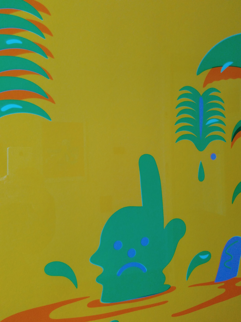
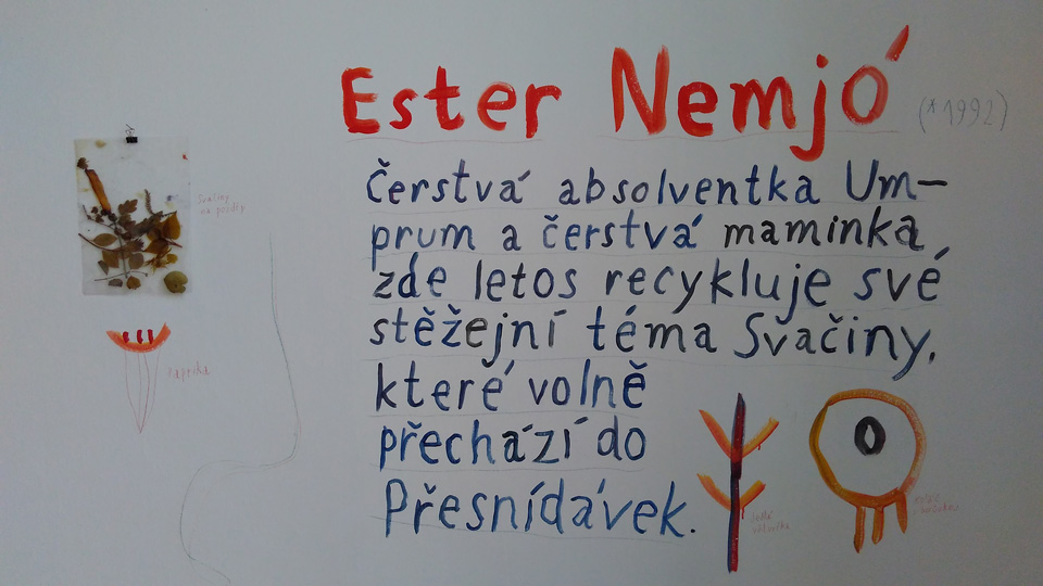
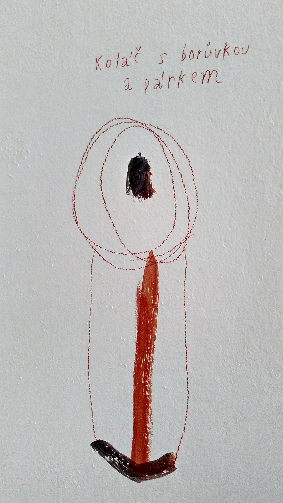
Ester Nemjo: Not sure if this was the artist’s name or an invented character. But the approach was one of the most fresh and fun one’s I saw in the show. Very relaxed. Different from the majority. Simple yet powerful.
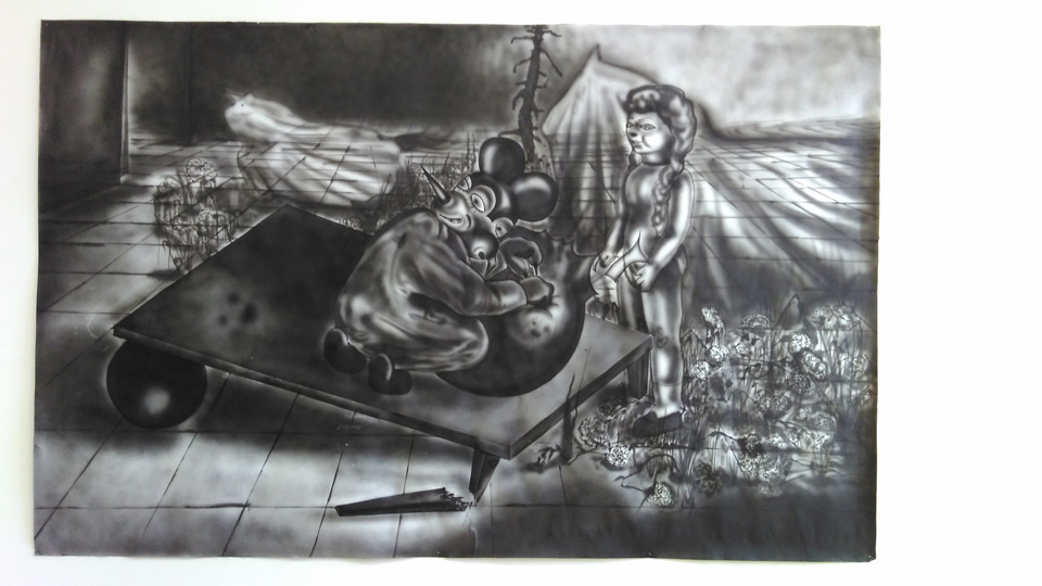
Eva Macekova: Reminded me of Josef Bolf, Neo Rauch and a bunch of other artists. Somehow very familiar, but I could not locate it exactly.
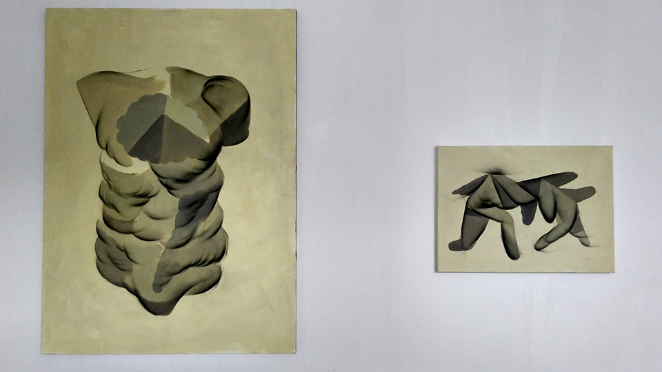
Jakub Tykadlo: These were pretty good paintings. Disturbing, but in a good way. Francis Bacon-like disturbing. Weird shapes somewhere in between body parts and body organs.
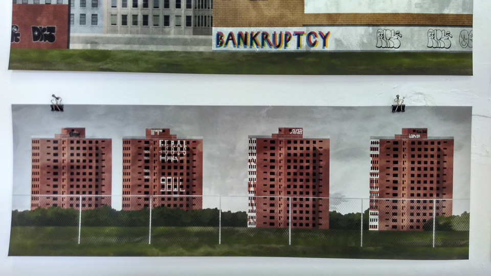
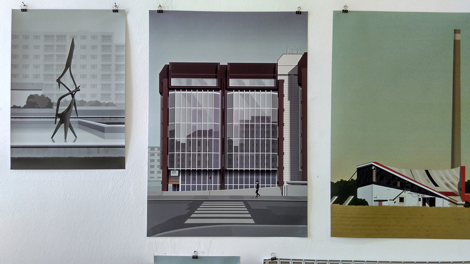
Jan Sramek: Architecture, yay! Precise digital drawings/paintings of existing sites in Czech Republic, I assume. Socialist architecture and sculpture.
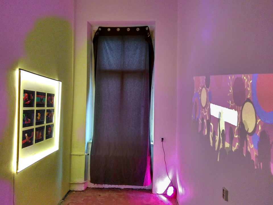
Long Phi Trieu (Longiy): A multi-media installation featuring a projection, sound, photographs and custom lights. A room with a special atmosphere. The photo story (photographs of paintings only, unfortunately) connected with the environment.
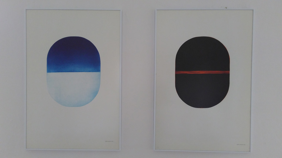
Maria Makeeva: Minimal empty landscapes (land/sky), this were traditional prints (dry point?). I wish they had oval-shaped frames.
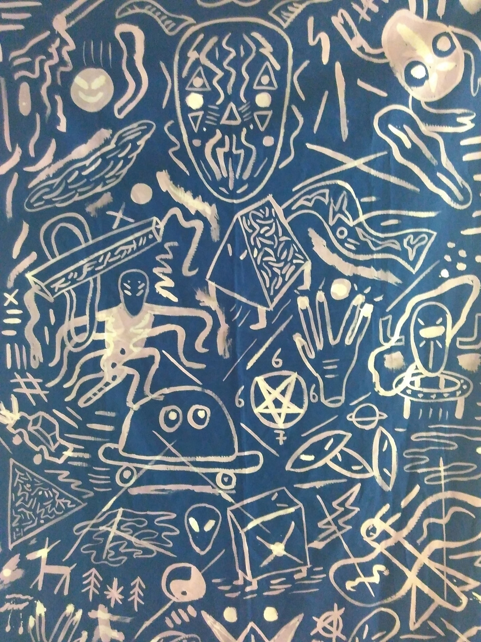
Marie Vermont (Soybot): A foreign guest from Austria. Wild, almost indigenous style. Something between cave painting and cargo cult.
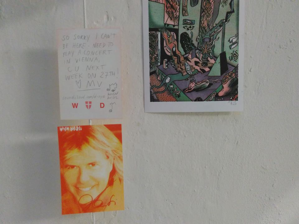
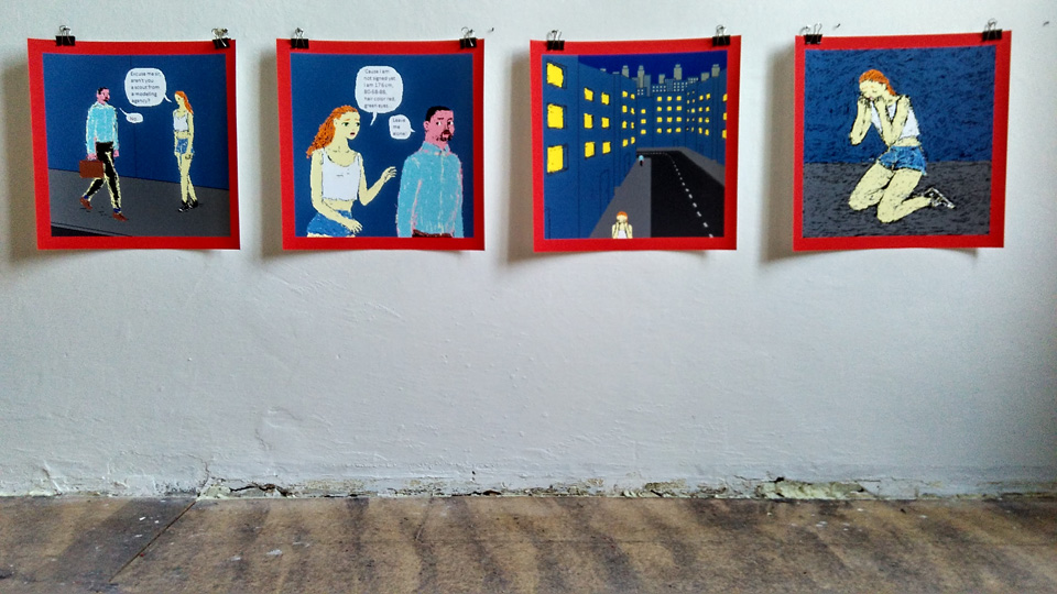
Martin Lacko: Pixilated comic strips with simple funny stories, newspaper grade (very good).
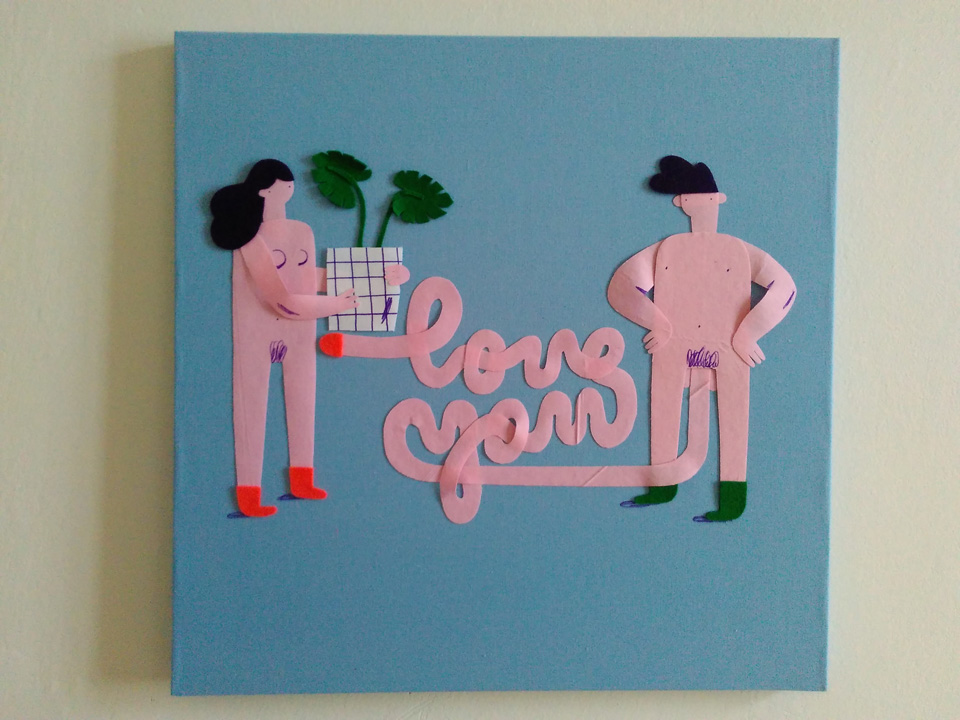
Michaela Mihalyiova: Character illustration cut out from felt, funny. There was a whole series of them.
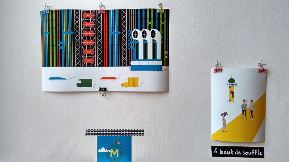
Pavel Mrnous: Diary-style travel illustrations. The minimal way of drawing cars was funny and efficient.
Vaclav Havlicek: Colorful, joyful, bit edgy.
