June 12 – July 12, 2015, Facebook
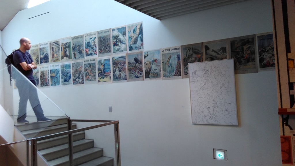
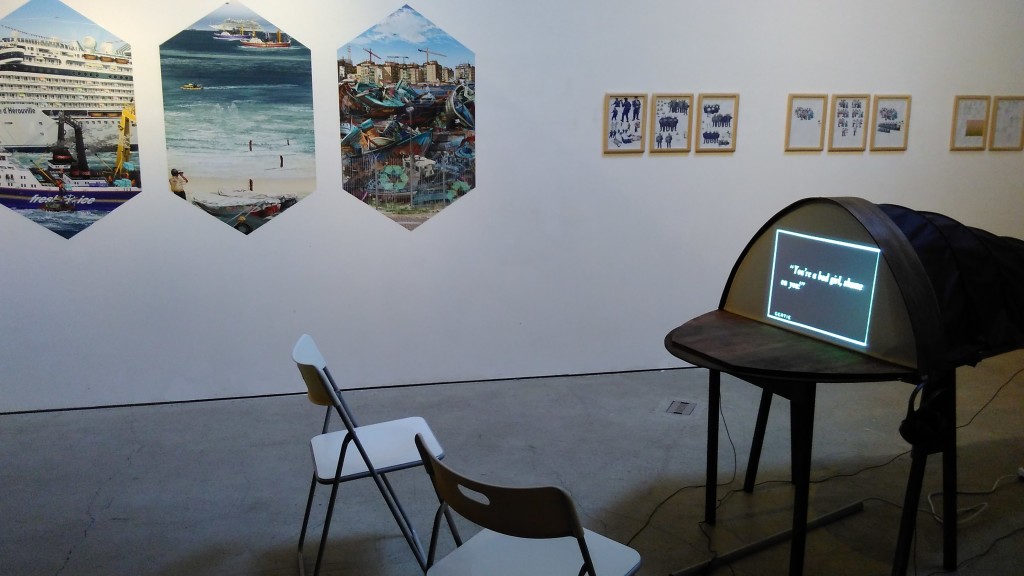
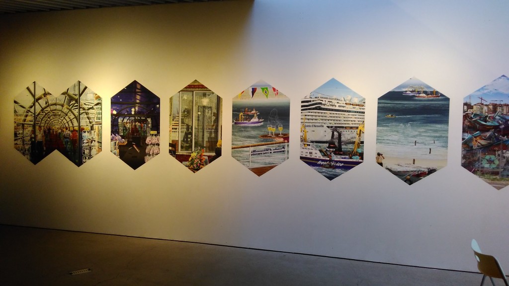
A research-based exhibition by a German curator (Clemens Krümmel). It consisted of quite a lot of small works, most of them prints or just facsimiles of artworks, plus some video works. It made me think of Anselm Franke shows or the research based shows which Para Site in Hong Kong is sometimes showing. But the topic presented stayed too abstract to grasp it in words.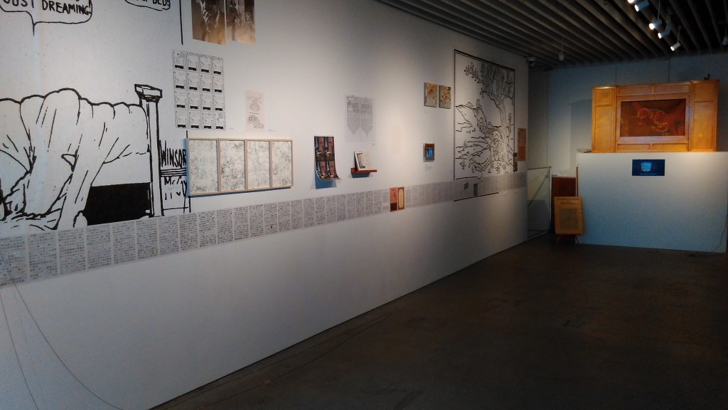 I did not really feel incited to read and study the works in detail and I walked through rather quickly. The press release talks about the relationship between images that stand for itself and supporting layers (text or verbal explanation). I agree this motive was present, yet I could not really grasp it from walking through the show. Probably I would have to go very slowly, trying to read all the little paper snippets pasted on the wall. I would say this kind of more ‘difficult’ exhibitions usually need a rather simple and straightforward topic, which the visitor than can dive into, but doesn’t have to and still can get something out of it. When the topic (or title) is already ambiguous as in this case, and the layered text-image works are also ambiguous, then orientation is easily lost.
Wandering around and pondering the difference between Para Site’s shows (e.g. Plague Year, Sex in Hong Kong, or this year’s Hundred Years of Shame), Anselm Franke shows (like Taipei Biennale 2012 or the Animism exhibition) and Talking Picture Blues, I also realized that there was a shortcoming in the installation of the show. The installation and the strange angled space of Song Won Art Center seem to mutually clash rather than support themselves. When the architectural design of a space already calls so much attention to itself, the artworks have often no choice but to submit and adapt to the space, but here there was not enough of that. The installation felt utilitarian (e.g. put up a black curtain to block light), but lacked a sensitivity towards the space.
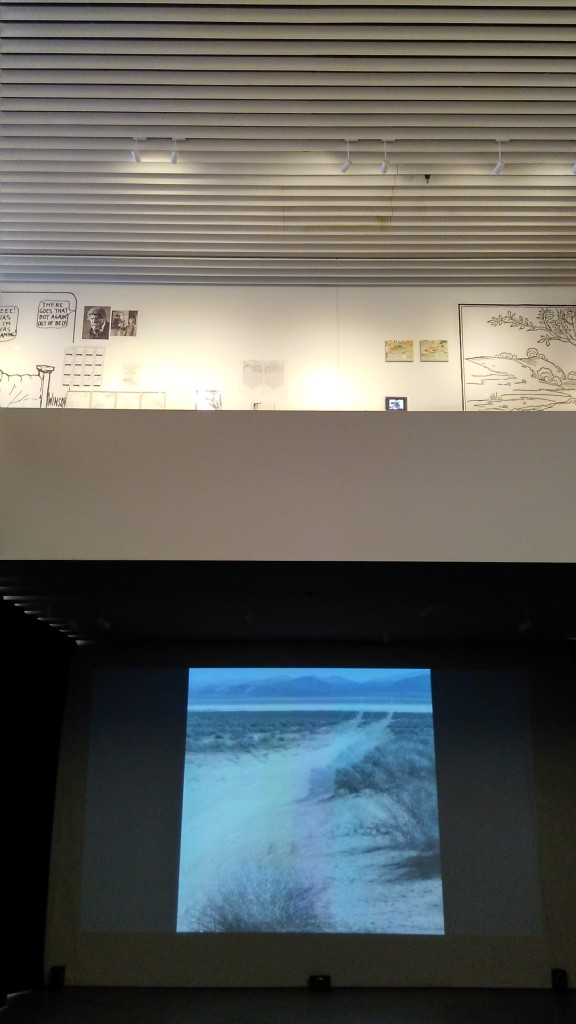
Overall I felt that the curator tried to present a well-researched discussion on a complex topic by using a complex methodology. I remember some works, like the large stereoscopic projection downstairs, but I remember it mainly as a technological object, not as an artistic narrative. Same goes for a large ‘moving/talking’ painting scroll in a large cupboard (a historical artefact from the U.S.A.) which I remember mostly as a piece of furniture and not so much for its actual function, displayed in a small documentary video beside it. I can imagine that a lot of research effort went into this exhibition and that imagine it could work very well in the form of a printed book with a DVD supplement where text and image could be overlaid and juxtaposed. But similarly as graphic design is important to create a balanced fusion of text and image in the case of a book, so a detailed exhibition design was needed to create a balance between the exhibition space and the exhibits in this show.
